Choosing an exterior paint color is one of the most consequential decisions a homeowner makes. Get it right and your home looks polished, grounded, and completely at home in its surroundings. Get it wrong and no amount of landscaping will save it. In the Pacific Northwest, where the light is soft, the landscape is lush, and the weather is relentless, color choice matters even more than it does elsewhere.
Why Pacific Northwest Light Changes Everything
The PNW is famous for its overcast skies — and that diffused, grey light changes how colors read on a home's exterior. Colors that look warm and vibrant in California showrooms can appear dull and flat under Seattle's grey sky. Bright whites can look stark and cold. Saturated jewel tones, on the other hand, often come alive in low light in a way they don't in direct sun. This is the first thing to understand when choosing an exterior color here: always test samples in natural PNW light, at different times of day, before committing.
Colors That Work Beautifully in the Pacific Northwest
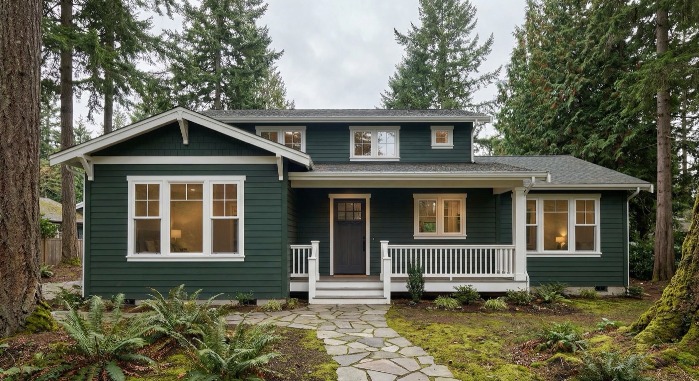
Deep Sage and Forest Green — Nothing harmonizes with the Pacific Northwest landscape like green. A deep, muted sage or forest green feels intentional and grounded, especially on craftsman-style homes or modern farmhouse builds. It reads as sophisticated rather than trendy.
Warm Greige and Taupe — The warm grey-beige family is a perennial favorite for good reason: it photographs well, ages gracefully, and complements virtually every material — cedar siding, stone accents, dark trim. Sherwin-Williams' Accessible Beige and Agreeable Gray are classics in this region for a reason.
Navy and Deep Blue — A deep navy exterior with crisp white trim is a striking combination that works especially well on two-story homes and modern builds. It holds its color even in low light and has a timeless, high-end quality that adds curb appeal and resale value.
Warm Off-White and Cream — Pure bright white can feel cold in Seattle's light. Warm off-whites — creamy, slightly yellow-toned whites — feel much more inviting. Think Benjamin Moore's White Dove or Sherwin-Williams' Alabaster over a bright optical white.
Charcoal and Deep Black — Modern and contemporary homes in the Eastside and Seattle neighborhoods are increasingly embracing dark exteriors. A deep charcoal or near-black exterior is bold, dramatic, and genuinely stunning when paired with natural wood accents and large windows.
Colors to Avoid
Bright yellows and oranges that look cheerful in sunnier climates tend to look garish and out of place in the PNW. True bright white can read as harsh. And highly saturated jewel tones without careful coordination often clash with the natural surroundings rather than complementing them.
Don't Forget the Trim
The trim color is what ties an exterior together. Crisp white trim with a dark body color creates definition and polish. Tone-on-tone trim (a slightly lighter or darker version of the body color) creates a more modern, seamless look. Whatever you choose, the trim deserves as much thought as the main color.
Test Before You Commit
Always purchase sample quarts and paint large swatches (at least 12 inches square) directly on the home's exterior. Observe them at different times of day — morning light, afternoon, and on an overcast day. What looks perfect on a paint chip will look different at scale on your actual home.
At Vasy Painting, color consultation is part of our process. We help Seattle and Bellevue homeowners find colors that work with their home's architecture, their neighborhood, and the Pacific Northwest environment. Get in touch to schedule a consultation before your next exterior project.